On August 17, 2026, the Jane Addams Hull-House Museum launched a new visual identity and website. In anticipation of this transformative moment for the museum, Hull-House associate director Matthew Randle-Bent presented a series of questions to the design team: Tobey Albright and Mollie Edgar of Hour Studio; and Renata Graw of Normal Studio. Here, Tobey, Mollie, and Renata reflect on what it means to craft a new vision for such a historic institution.
As designers, what is exciting or unique about working with a historic site like Hull-House?
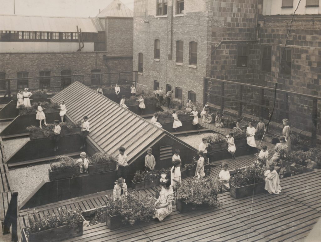
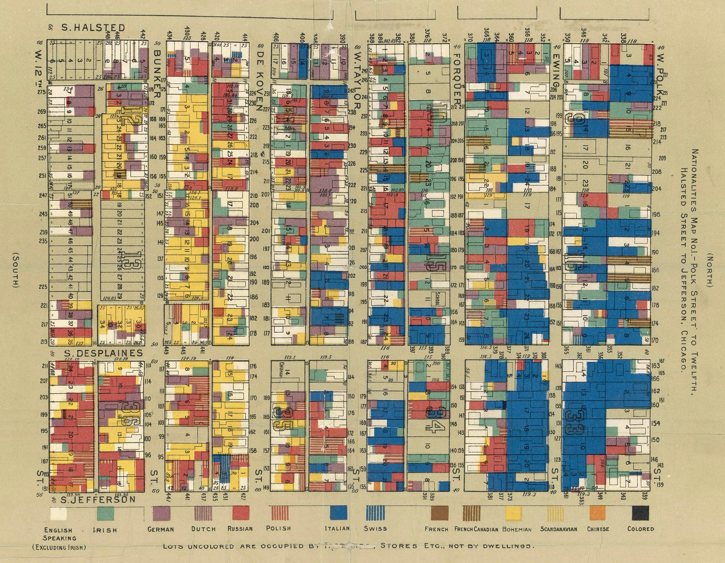
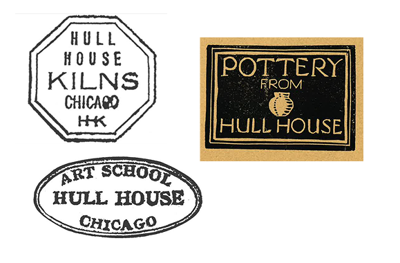
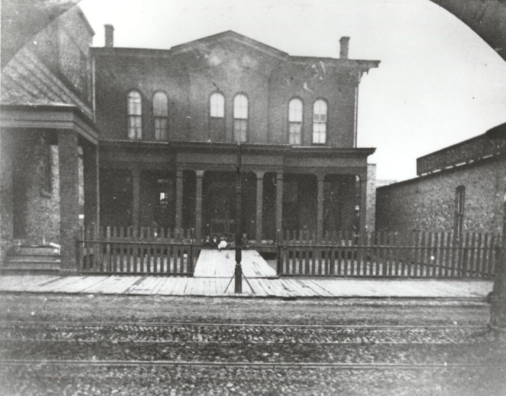
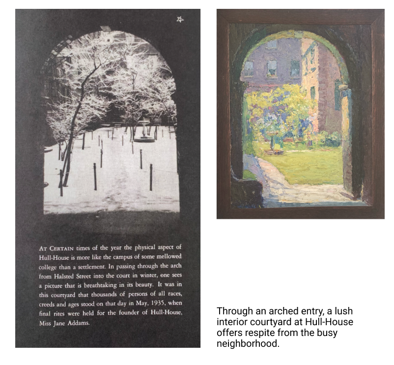
When we first started the process, we were all very excited to see the graphic materials and collateral that had been produced throughout Hull-House’s existence. One of the first questions that came up for us was how had graphic elements (logos, typography, institutional marks) evolved and been used over time. We were interested in seeing if there were elements from the past that could be repurposed or built upon. We wanted the identity to honor Hull-House’s rich history while still positioning the institution in the present day and, of course, future.
You are by now very familiar with the Hull-House collection and archives. Are there materials you discovered in your research that were particularly inspiring?
Some of our biggest inspiration came from Jane Addams and Ellen Gates Starr’s values. Their courage to open the Hull-House doors to people of all backgrounds, classes, and ages, particularly during that time period, inspired us most. They had a vision for the Hull-House that went beyond anything that existed during that time. They helped establish one of the country’s first kindergartens to help working immigrant mothers. We loved learning this history, but also learning how the space was activated with plays, classes, art, book clubs, dinners, and gatherings.
Archival References
Talk us through some key elements of the new identity.
When we first started work on the museum identity, Tobey and Mollie had already developed the Hull-House Books and Hull-House Theatre identities. We immediately knew the museum’s graphic language had to work with those other elements and maintain the character of supporting diversity through time as opposed to flattening it into a monolithic brand.
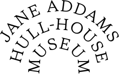
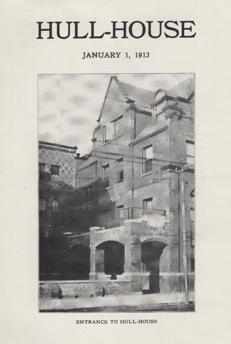
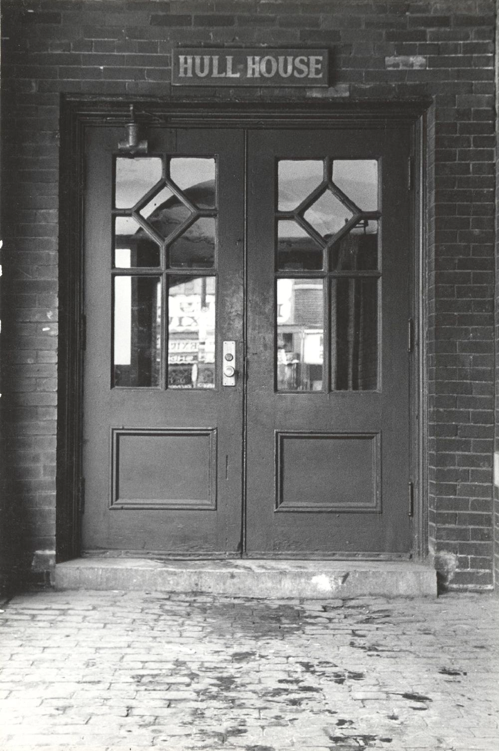
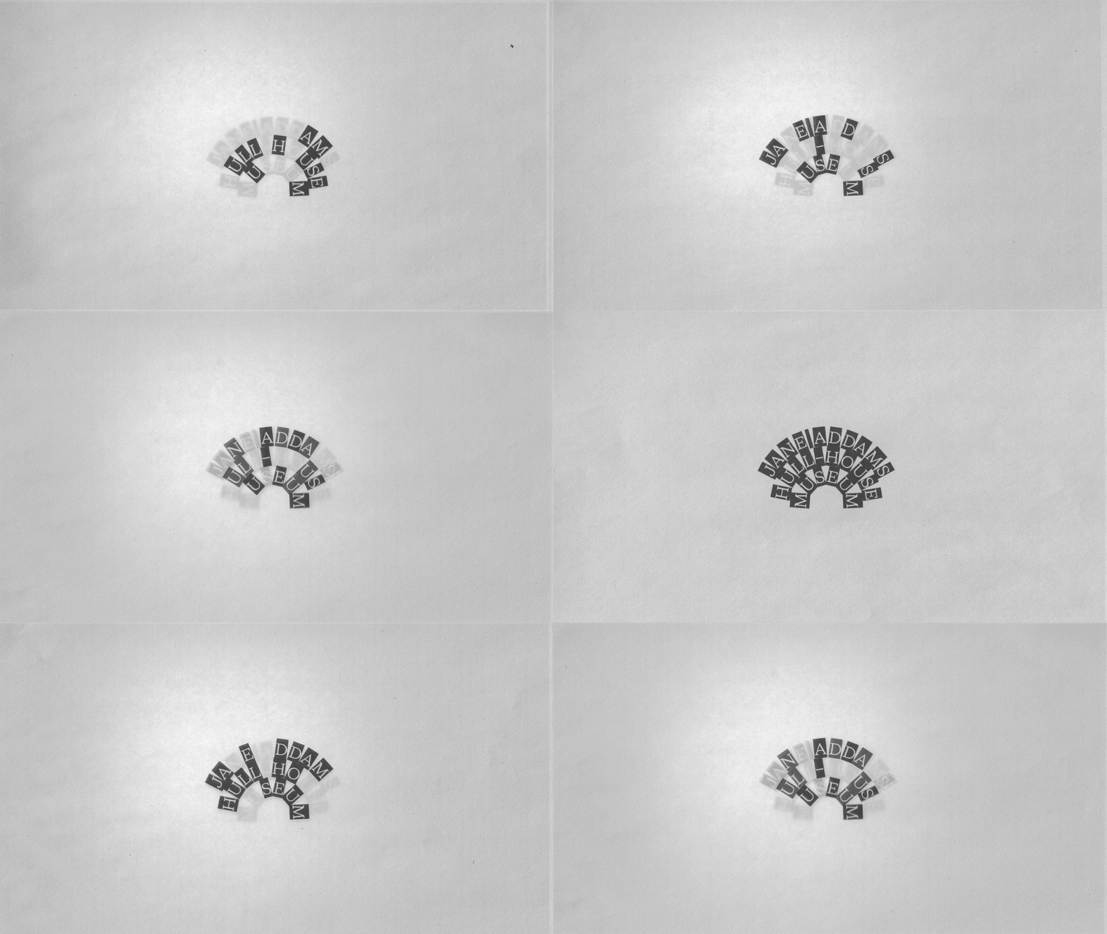
Since the architecture is such an essential part of the museum, we focused on the historic arched entry as inspiration for the main logotype. A curved arch implies a center. The nested typography radiates outward from center beyond the museum—first into the neighborhood, then across the city, and perhaps throughout the world. We loved the way the primary logotype feels as though it’s a beacon, broadcasting Jane Addams’ and the Hull-House communities’ social reform work out into a world that benefits from knowing this type of inclusion and care has existed for decades and will continue to into the future. The animated version of the logotype sparkles, pulses, radiates and is intended to feel as alive and active as the human hands and spirits that have shaped the Hull-House through time.
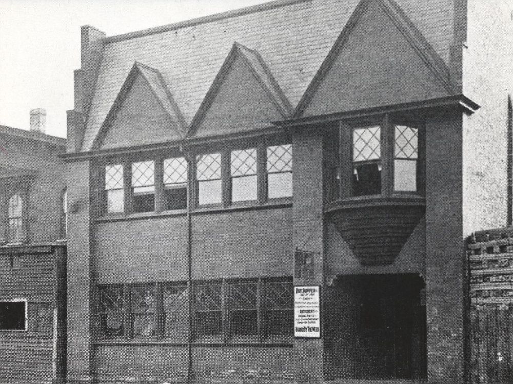
This primary (arched) arrangement is just one version of the logotype; we also developed secondary versions to be used when space is not abundant. Besides the typography, the color palette and the use of frames and strokes are all derived from the museum’s building and collection of vintage ephemera.
When researching typefaces, we knew we were interested in a serif that could work in tandem with the university’s [University of Illinois Chicago/UIC] sans serif typeface, Theinhardt, which remains a key part of the museum’s brand. We were also interested in working with a female typographer as a means of acknowledging the remarkable women who worked behind the scenes in foundries when Hull-House was founded, yet rarely received recognition. We were lucky to come across Octavia, a low-contrast serif designed by Flavia Zimbardi, with a perfectly wide uppercase “J.” According to Zimbardi’s website, “Octavia was first designed by Tida Tep in 2017 and it shines with a nostalgic charm and open color that provides optimal readability.”
Tobey and Mollie, you have now worked on multiple projects with the museum over the last few years. How does this project represent a continuation or realization of that work? And, Renata, how has it been entering into and contributing to this unfurling design world?
TA/ME: As a studio, longterm relationships are the greatest indicator that the work we do with others is working. Nurturing relationships and helping the arts survive and thrive is a characteristic we have always felt strongly when visiting the Hull-House Museum and working with its staff and public. We think this energy feels embedded in the space and ongoing ways the organization continues to activate and support the communities in Chicago and beyond. Thankfully, there’s a substantial archive that we could pull from to help reanimate this historical energy and be a part of the continuity that’s been so influential for so long. We have been working with Renata on several UIC CADA [College of Architecture, Design, and the Arts] websites the past few years and we were thrilled to have her help us formulate the work we had started and think through how it could be expanded upon in a broader sense, while still respecting the work we’ve been doing with the UIC CADA design team. Renata has such a brilliant way of designing within systems that feels more fun and adventurous than sterile and restrictive.
RG: It is always such a pleasure to work with Tobey and Mollie. They are such thoughtful and talented designers. What I love most about this project is how it evolved with each of us adding our own piece to it, making the outcome so much stronger together than any single contribution.
It would be easy for design in a museum like Hull-House to feel nostalgic, but your work with us feels so forward-facing. Why does that feel important to you?
Because being a part of the Hull-House Museum’s historical continuity is so important to us, we intentionally wanted the identity to have elements from the past: the colors are warm—not electric, not too bright, not relying on RGB color space. All animations had to feel more analog—frame-by-frame—rather than digital, smooth, and bouncy. On the other hand, we definitely did not want this identity to fit within the “modernist” canon. And most importantly, we did not want it to feel old and tired. It’s truly a balancing act of the highest order, with great reward.
This became a good design question: how do we rely on “traditional” graphic elements and still make the identity feel forward-facing? It became a matter of mixing the elements together, with a touch of courage when cropping images (through the frames of the windows) and a touch of restraint, like knowing when it’s okay to center your type. It’s always okay, but sometimes we all know we just shouldn’t.
Let’s talk about the website, which is the way most people first encounter the museum. What are some of the key features here designed to improve the visitor experience of Hull-House?
We knew we wanted the website to be a reflection of the energy that we’ve all felt when visiting the museum in person. The museum’s building is a bit hidden and often missed against the backdrop of the UIC brutalist campus it’s nestled within. We used large typography throughout the site to highlight the values, mission, and thoughts behind the organization, and made sure to bring the many events and exhibitions to the foreground. To really bring the museum’s spaces and experiences to life, we brought in Bob. as collaborators to create a series of short spatially-focused video reels to help express the scale and warmth of the spaces within the museum.
Finally—you know that I’m especially keen about our new merchandise. Is there a merch item you’re particularly excited for people to discover?
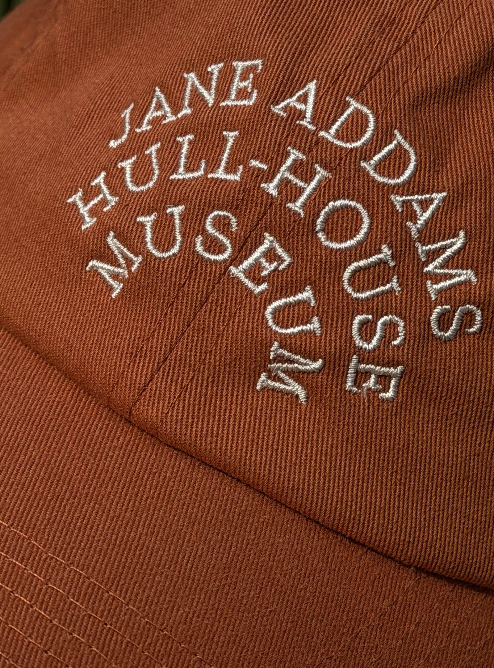
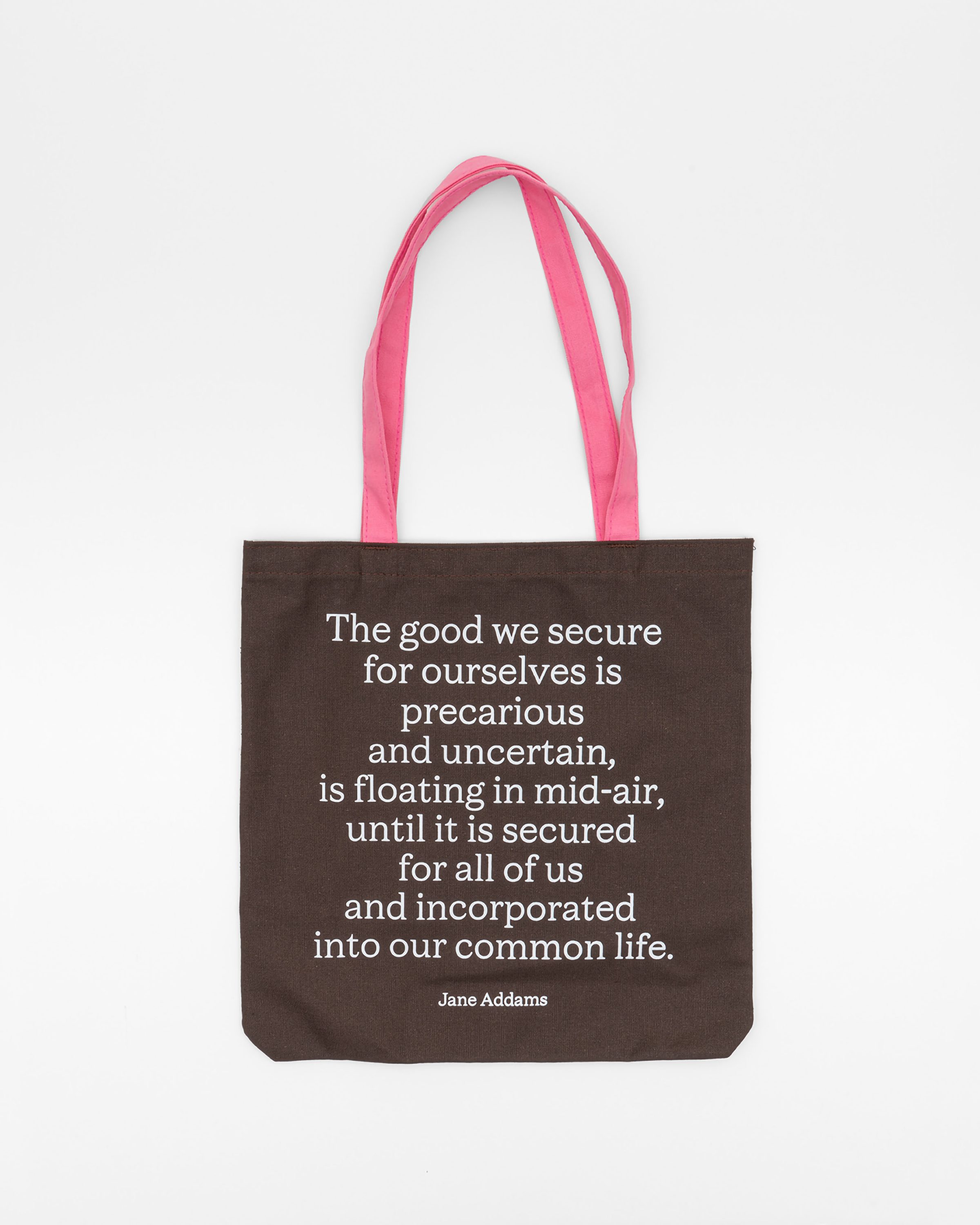
We are all very excited about the merch, which extends the museum’s reach into people’s lives through objects they can treasure. We love that the quotations from Jane, which were a central part of the identity, have found a home on a number of these items. Her words feel incredibly relevant today.
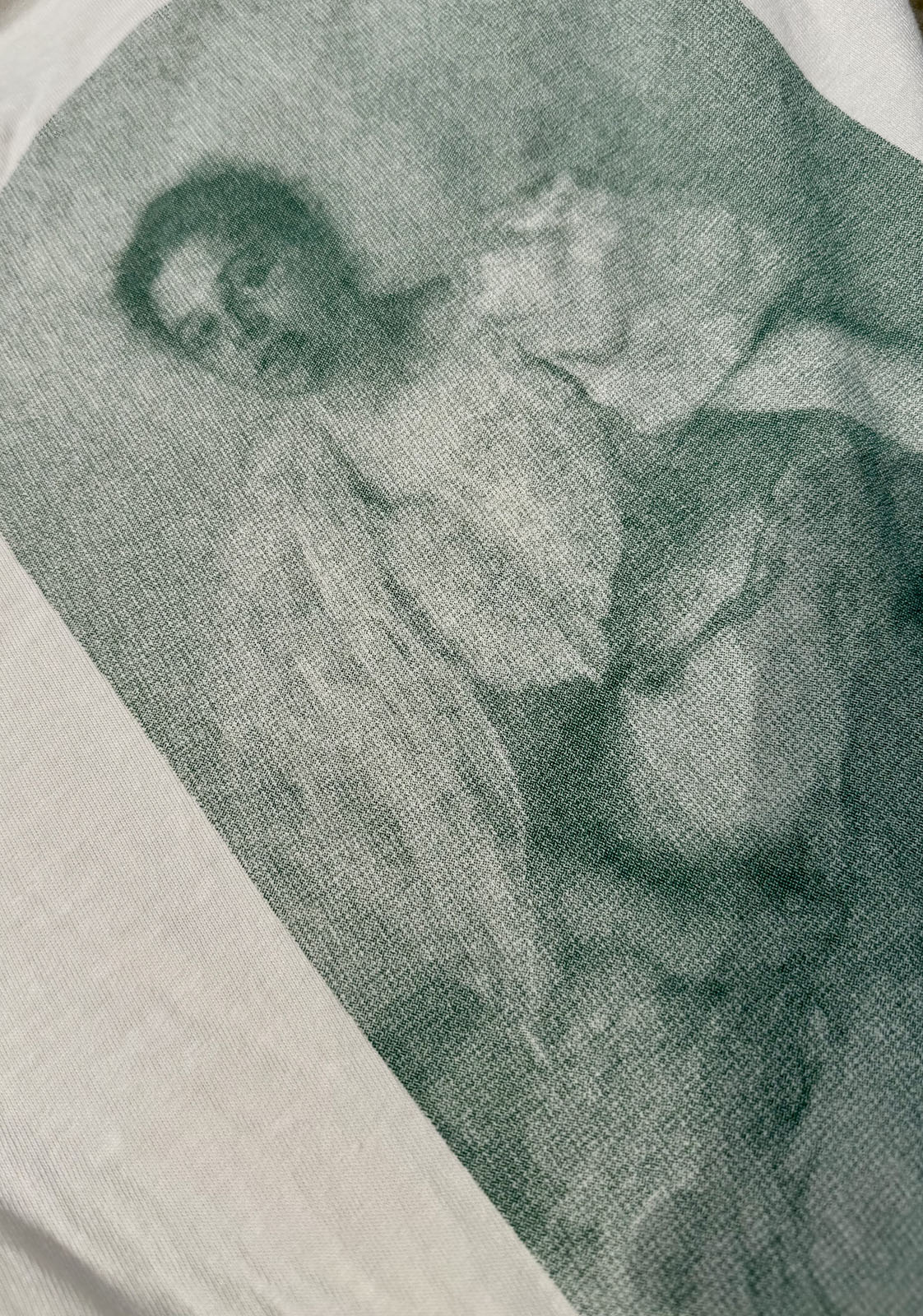
We also incorporated a couple of favorite pieces from the archive: an early infographic of a Wage Map and a portrait of Jane’s partner, Mary Rozet Smith, into the t-shirt designs. We hoped visitors would come to see these potentially unfamiliar items as integral to the history of Hull-House.
Design Credits
HOUR DESIGN TEAM
Tobey Albright
Mollie Edgar
Ashley King
David Maruzzella
Sarah Wang
NORMAL DESIGN TEAM
Renata Graw
Lucas Reif
Austin Watson
DEVELOPMENT
Daniel Miller
TYPOGRAPHY
Octavia by Flavia Zimbardi
Theinhardt by François Rappo
VIDEO & PHOTOGRAPHY
Bob.
MERCH
JUS
VIDEO PARTICIPANTS
The Weaving Mill
UIC Student Leadership and Civic Engagement